Science · Code · Curiosity

Analysing a successful genome
Now I have some images that have evolved over a million generations, I thought I’d do a bit of analysis on the resulting genomes. I predicted that the distribution of circle sizes and transparencies would not be random.
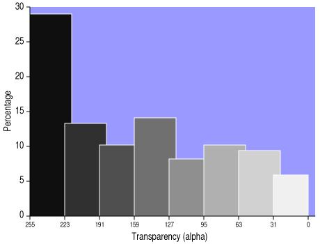
The graph below shows a histogram of transparencies for the 256-circle genome after a million generations. It shows that ~6% of circles are in the most transparent group (you would expect 12.5% for a random distribution), while nearly five times as many circles are in the most opaque group. I predicted that the first circles in the genome (those drawn first), would be more likely to be larger and more opaque compared to the circles drawn later. Unless there is an large circle in the target image, there should not be a large opaque circle towards the end of the genome; there may, however, be large opaque circles in the background.
To test this hypothesis, I plotted the transparency of each circle against its position in the genome (which can be considered its position in the z-axis: circles are drawn in the order they appear in the genome, so the first circle in the genome is the first to be drawn, thus at the bottom of the 'stack' of circles, most likely to be covered by later circles).
I’ve been experimenting with different ways of visualising data (and playing with SVG files generated by python scripts), so I thought I’d try to display additional information. Rather that plotting the graph as points or a line, I have used circles whose size and colour reflects the size and colour of the circle being plotted.
Alternatively, I could have plotted, say, circle size along the y-axis and plotted transparency by plotting circles with the corresponding transparency, but I figured that transparency would be the hardest value to gauge by site, especially since a dark grey circle would be indistinguishable from an opaque light grey circle unless it overlapped with another circle. Instead each circle in my plot has a transparency of 0.5. to allow overlapping circles to be seen.
I hope you agree that the plot above actually shows that there is a slight increase in transparency as you go along the genome. The early part of the genome appears to consist mainly of large, dark, opaque circles, which presumably make up the background.
This is also true, perhaps more clearly, for a genome of 128 circles evolved for over a million generations (below). It appears therefore, that the nearer circles are to the end of the genome (thus the ‘top’ of the stack), the more transparent they are, and thus the less likely they are to completely overwrite previous circles.
Both graphs show that many of the circles near the start of the genome are nearly completely opaque. Which makes sense as they are unlikely to be visible otherwise.
Leave a comment
Comments are moderated and will appear after approval.