Science · Code · Curiosity

Analysing an evolutionary trajectory
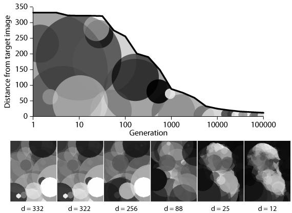
I now have re-run the evolution of an image Darwin using 128 circles, this time recording the genome and the distance the resulting image is from the true image (which is the inverse of a genome's fitness) for every generation in which an improvement is found. Below is a graph showing how the evolved images become a closer and closer match to the true image. I’ve also added example images from generations 1, 10, 100, 1000, 10000 and 100000 with their corresponding measure of distance (d, in arbitrary units).

As a side note, the graph is only an approximation of the full set of results, based on the values from 21 evenly spread (on a log scale) generations. The reason for this is that I drew the graph in Adobe Illustrator, to see what it’s graph-drawing function was like. It’s not too bad. Though it is obviously quite limited, Illustrator does let you draw distracting circles in the background.
The graph shows that largest decrease in the distance value (and therefore the largest increase in fitness) occurs approximately between generations 100 and 1000. However, I would say that the biggest increase in subjective image quality is between generations 1000 and 10000. There is relatively little change between the images of the first 100 generations, suggesting that not much improvement can be seen on that timescale.
By generation 1000, the distance value has decreased significantly, but the most we can say about the image is that there is a general area of lightness in the centre with darker regions at the periphery. By generation 10000, the general shape of darwin’s head is in place, and by generation 100000, the outline is sharpened and some of the details, such as the nose and mouth can be seen. Who knows how close the image could get by the millionth generation? Not me, it would take too long on my computer, but if I could use the GPU…

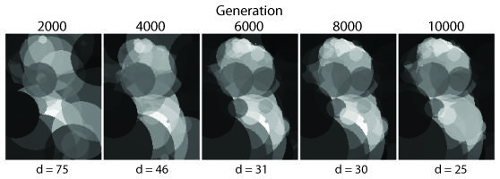
These images are from generations 2000 to 10000 with their distance values. This looks like the time when Darwin’s image begins to take shape.
Leave a comment
Comments are moderated and will appear after approval.